This is solid visual that shows what physically happens when you use the internet…check it out.

Equally cool is the maps of undersea cables that connect continents! Thx Paul for sharing:)
This is solid visual that shows what physically happens when you use the internet…check it out.
Equally cool is the maps of undersea cables that connect continents! Thx Paul for sharing:)
Google Classroom has a very solid online training center. For those of you that prefer this learning method we recommend cross referencing the ZIS Upper School specific training materials for deep context.

Sometimes email can seem like a black hole of time and energy. How much email do you actually send? How much do you receive? Who emails you the most? Check out immersion, a visualization tool developed at MIT’s media lab to help you reflect on your use of email and perhaps find ways to optimize communication with your top connections. If as a faculty member you have a lot of student communication within email, brainstorm ways to move these conversations into a more appropriate realm like your digital class space or within the work itself with comments.
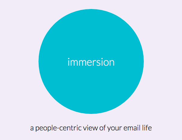
Below is a screenshot that takes you to a demo:

Check out this infographic from Edudemic and Boudless to brush up on your ed tech lingo.

Below are three examples that are included in the Social Studies Data site that we will play with today and Thursday during Google school (rm 110 12:20-40)


created by Tech and Learning
